Deployed strategically, color offers the ability to influence the way we experience the world in all its sensory parts.
Think back to how you chose your most recent bag of coffee. Was it because of a minimalist design or a brightly colored pattern? What about the latest cafe you visited: did you get drawn in by its natural materials or an overall color scheme? You may be unable to articulate your reasons because these choices are often subconscious. There are many ways to experience a coffee, and setting the scene with color is just one way to manipulate it.
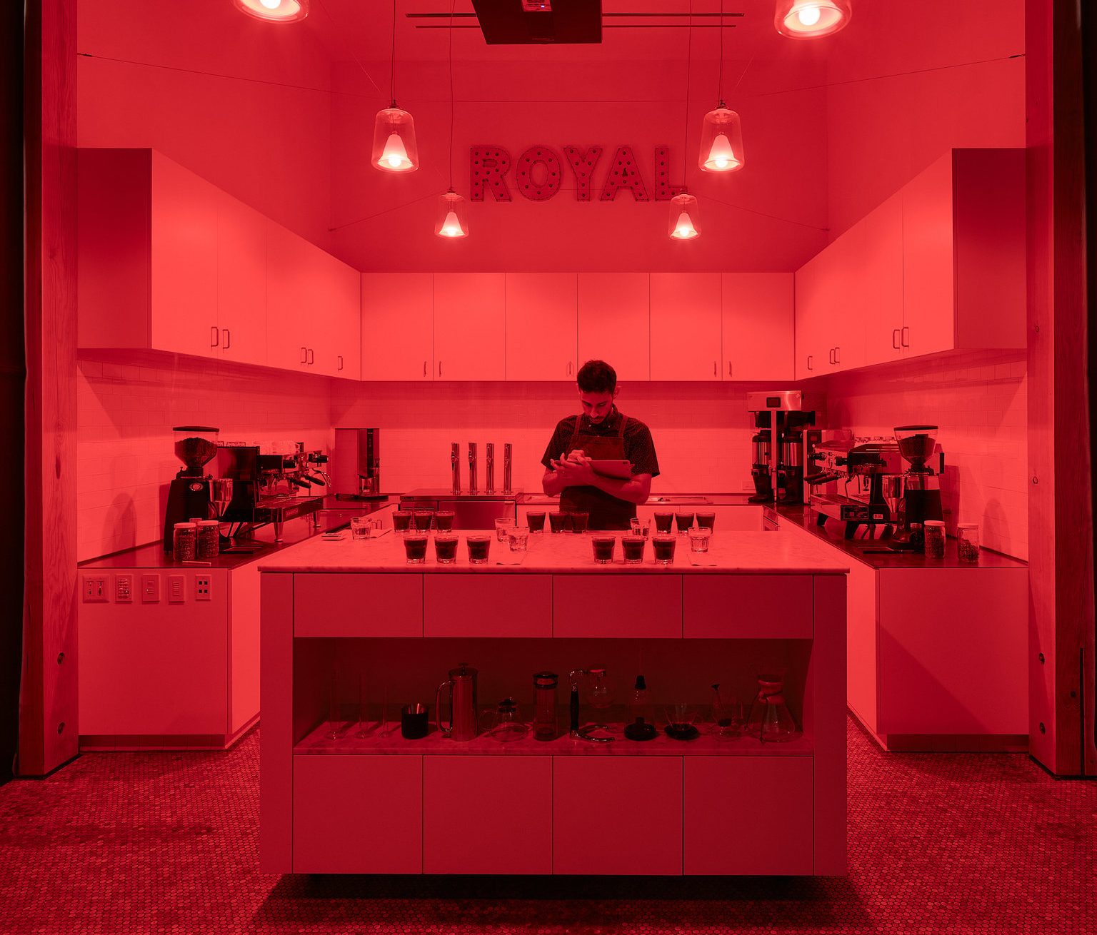
Color impacts the coffee journey starting from the very beginning. Before coffee reaches your favorite roasters, it first passes through Q graders, who use all their available senses to evaluate coffee. To obtain certification, they must first pass a series of sensory evaluations. But, in tests like Matching Pairs, Triangulations, and Roast ID, where other senses are being tested, a red light is used to remove visual cues. “These exams confirm the cuppers’ ability to use their sense of taste and smell to identify differences in coffee; we want to ensure that cuppers are not using other clues—like visual differences—to discern the difference between two cups,” explains Sandra Elisa Loofbourow, owner of Loupe Coffee Consulting and a CQI instructor, via email.
Next, we have packaging. We’ve seen a wide range of design choices in coffee: from brown kraft paper to a simple label on a white bag to maximalist in color and shapes. Just a glimpse through this year’s Coffee Design Awards entries in packaging shows how diverse one year’s designs can be.
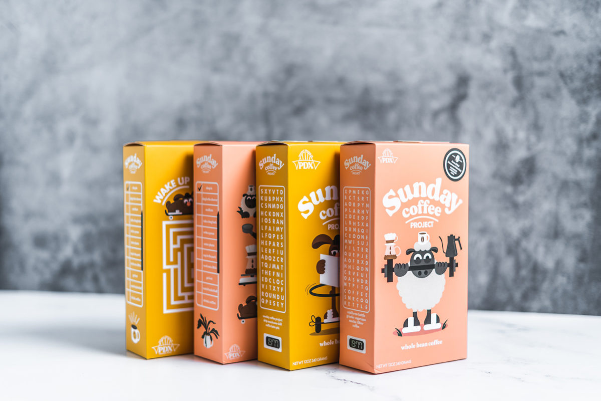
The psychological part of color theory tells us what feelings we associate with certain colors. If you organize your phone apps by color or category, you’re probably already familiar with this. Blue builds trust, which is why so many bank logos have blue in them (however, remember that color doesn’t solve everything; it can only help build so much trust). Red warns us of danger or to stop before we go. Green is all about growth and nature.
While there are many studies published about the various influences that color and package design have on consumers, one study looked more closely at package colors that deviate from a category norm. Researchers showed consumers two different products in typical and atypical category colors: orange juice was placed in both an orange box (typical) and a blue box (atypical), and sparkling wine in a gold-wrapped bottle (typical) and purple bottle (atypical). “The results show that an increase in package color typicality decreases consumer skepticism and enhances interest, leading to more positive attitudinal and behavioral reactions,” the study concluded. “In contrast, package color atypicality was found to negatively influence consumer preferences.” Basically, it’s nice to stand out on the shelf but don’t go too far out of the category norm.
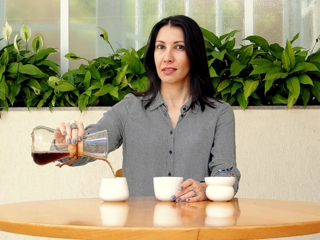
Dr. Fabiana Carvalho is a neuroscientist, a researcher at the University of Campinas, Brazil, and the founder of The Coffee Sensorium Project. In her upcoming talk at Re:co Portland, Carvalho will be sharing detailed results from a research project on how the colors of the cups and coffee bags impact consumer expectations and perceptions of the coffee. She confirms via email, “We have found that colors hugely impact both sensory and hedonic (i.e., related to pleasantness of consumption) judgments of the coffee.”
“Colors can be used to communicate the main flavor notes of a coffee. It’s important to choose the right color palette based on the overall sensory profile of a coffee,” says Carvalho. “By doing so, the bag design itself can already indicate the sensory characteristics of a coffee, such as the roast level, and the main aroma/flavor notes.” If you don’t differentiate with colors, you risk making a mistake as I did, which was to buy a very dark-roasted coffee when I thought I was buying a light-roasted one (the only indicator on the roast level were tiny words in the corner of the label—entirely my fault for not looking more closely).
In these Instagram days, we make assumptions and judgments about a cafe before even stepping inside. Everything from bags to wall colors to equipment create indicators of what your experience will be like.
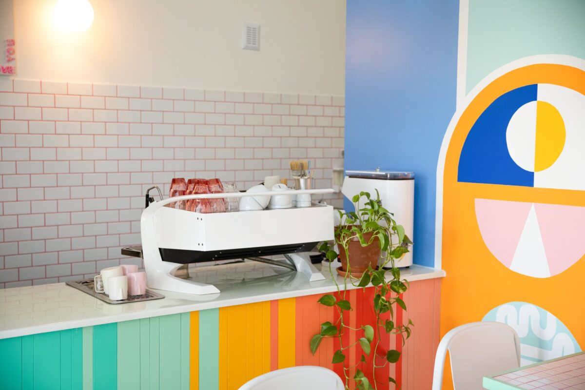
In Japan, researchers examined color interiors of cafes, how people felt upon entering, and their expectations of the coffee’s taste. Kosuke Motoki is an assistant professor at the University of Tokyo and one of the researchers on the study. About their findings, he says, “The greenish, darker-colored interiors create feelings of calmness, which increased the expected tastiness of the coffee and then increased their likelihood of visiting.” Reddish and lighter-colored interiors gave people the expectation that the coffee was sweeter, while the greenish, darker ones were associated with sour/bitter/tastier coffee.
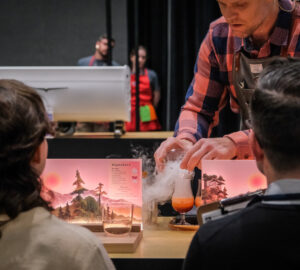
But then, why aren’t all the cafes dark and green? To help answer this, I turned to an interior designer whose firm has worked on restaurant and cafe interiors, like the 36 Below cocktail bar in the photo above. “Design is innovative, and there is no one-size-fits-all color scheme that can be considered the ‘ideal’ choice,” says Dala Al-Fuwaires, owner and principal designer of House of Form in Scottsdale, Arizona. “The right color scheme can play a crucial role in setting the tone and creating a welcoming atmosphere, but it should always be tailored to the specific coffee shop and its unique identity.”
As an example, she points to Peixoto Coffee’s downtown Gilbert location, which her firm designed. The large space incorporates stone, leather, and greenery to tie back in with the owner’s farm. Al-Fuwaires says, “Peixoto emphasizes the journey of the coffee bean, from farming to roasting, and incorporates earthy and natural tones that reflect their sustainable ethos.”
In addition to interiors, retailers could use color in their menus to highlight flavor profiles and origin. “Fruity coffees could be highlighted with bright and vibrant colors, such as shades of orange or yellow, to evoke the freshness and sweetness of the fruits,” she says. “Coffees from Central and South America, known for their nutty and chocolatey notes, could be represented with earthy tones of brown and green, inspired by the lush forests and fertile soils of the region.
Sensory expectations don’t stop at interiors or menu design; it also includes the mug you drink out of. In 2012, researchers found that coffee served in red glass cups was perceived as the warmest (38.3%), followed by yellow (28.3%) and green (20.0%).
Building on this, Carvalho and Charles Spence published a research study on cup color and its influence on consumer expectations. Four cup colors (white, pink, yellow, and green) and two very different coffees (sweet Brazilian coffee and an acidic Kenyan coffee) were provided to participants. They wrote: “The results revealed that the colour of the cup exerted a significant influence on both pre- and post-tasting ratings for all attributes measured. Liking ratings significantly decreased in incongruent pairing conditions – which also increased the unexpected acidity of the Kenyan coffee when tasted from the pink cup. Taken together, these results demonstrate for the first time that the colour of the cup significantly impacts sensory and hedonic judgements of specialty coffee.”
What stood out in the report for me were the notes on yellow: often a color associated with sourness, it instead “triggered expectations towards both acidity and sweetness in both coffee samples.” This difference could be because, in Brazil, where the study took place, the common yellow fruits are highly sweet, not sour. They pointed out that “participants in tropical countries may have a tendency to associate the colour yellow with sweet taste given contextual and cultural influences.” Colors often have different meanings in other cultures; more notably, the same color may not have the same name (about Candoshi, a Peruvian language, Jones writes, “The word kavabana was used for the color green all the way to the color purple, but kamachpa was applied to dark green.”).
At the SCA Sensory Summit EU in 2020, Assistant Professor of Food Science Qian Janice Wang conducted a live experiment with attendees on how cup color and cup weight affected the perceived flavor. Coffee served in black cups didn’t have any perceived difference in sweetness or bitterness from that in the white cups. But, “there was a significant difference in perceived body, where the coffee served in the black cup was significantly full in body compared to the white cup.”
What about the absence of color? 2D cafes have recently gathered steam worldwide, treating coffee drinkers with the experience of being in a comic book or flat illustration. In Chicago, 2D Restaurant combines interior designer Vanessa Thanh Vu’s “love for Parisian art with my passion for black and white Asian comics,” owner Kevin Yu tells me via email. “Our guests were invited to take a break from reality and jump into our 2D comic world.” The food menu is infused with Asian flavors that are quite bright in their presentation. “Any splash or glimpse” of matcha’s deep green, Thai tea’s bright orange, and ube’s rich purple “is amplified by its stark contrast, making it truly stand out,” says Yu.
Speaking of the absence of color, I’d be remiss to not mention colorless coffee. For a brief moment in the coffee industry timeline, CLR CFF shocked everyone by revealing clear coffee in a bottle. Coffee professional James Hoffmann tasted it back in 2017 and found it to have a smell of “rubber, burnt wood, and slightly rancid smoke” and a taste of “not really coffee flavored to be honest, that’s not coffee as I know coffee.” The product is not currently available anymore.
After learning about how colors influence your coffee experience, I wouldn’t blame you if you start second-guessing your next coffee decision. Let’s end on a mind-bender: What would happen if you drank this clear coffee from a clear glass in a black-and-white cafe? Would you even taste anything?
Jenn Chen (@thejennchen) is an Editor At Large at Sprudge Media Network. Read more Jenn Chen on Sprudge.


